The Psychology of Color in Home Design
How Color Affects Mood and Ambiance in Living Spaces
Colors are more than just visual stimuli; they evoke emotions and influence our mental state. When designing your home, it’s essential to consider how different colors can affect the mood and ambiance of each room.
Common Psychological Associations of Colors in Home Settings
Red: Energy, Warmth, Stimulation
Red is a powerful color that evokes energy and warmth. It can be used to create a stimulating environment in spaces like dining rooms or kitchens, where you want to encourage lively conversation and activity. However, using red in bedrooms might be overwhelming and too stimulating for restful sleep.
Blue: Calmness, Relaxation, Serenity
Blue is often associated with calmness and relaxation, making it an excellent choice for bedrooms and bathrooms. Soft blues can create a serene and tranquil environment, helping you unwind and de-stress. However, too much blue can feel cold and unwelcoming, so it’s essential to balance it with warmer accents.
Green: Nature, Balance, Rejuvenation
Green, the color of nature, brings a sense of balance and rejuvenation to your home. It’s perfect for living rooms and home offices, where a touch of nature can foster creativity and relaxation. Green can also be refreshing in kitchens, evoking a healthy and vibrant atmosphere.
Yellow: Cheerfulness, Warmth, Invigoration
Yellow is a cheerful and invigorating color that can brighten up any space. It’s particularly effective in kitchens and dining areas, where it can create a warm and welcoming environment. However, too much yellow can be overwhelming, so it’s best used in moderation or as an accent color.
Purple: Luxury, Creativity, Depth
Purple is often associated with luxury and creativity. Deep purples can add a touch of elegance and depth to living rooms and bedrooms, while lighter purples like lavender can create a soothing and dreamy atmosphere.
Black: Sophistication, Drama, Elegance
Black is a sophisticated color that adds drama and elegance to any room. It can be used as an accent color to create contrast and highlight architectural features. However, too much black can make a space feel dark and oppressive, so it’s best used sparingly.
White: Purity, Openness, Tranquility
White symbolizes purity and openness. It can make small spaces feel larger and more open, creating a sense of tranquility. White walls provide a neutral backdrop, allowing other elements of your design to stand out. However, too much white can feel sterile and cold, so incorporating textures and warm accents is crucial.

Cultural Significance of Colors in Home Decor
Different Meanings of Colors Across Cultures
Colors can have different meanings and associations across various cultures. When choosing a color palette for your home, it’s essential to be aware of these cultural significances to create a space that resonates with your personal and cultural identity.
Examples of Color Symbolism in Home Design Globally
Red in Chinese Homes vs. Red in Western Homes
In Chinese culture, red is a symbol of luck, prosperity, and happiness. It is often used in festive decorations and is a popular choice for front doors. In contrast, in Western cultures, red can symbolize passion, love, and sometimes danger or warning. Understanding these differences can help you make informed decisions about incorporating red into your home.
White in Minimalistic Designs vs. White in Traditional Designs
In minimalistic designs, white is often used to create a sense of simplicity, cleanliness, and openness. It helps to declutter the visual space and create a calm environment. In traditional designs, white may be used to highlight architectural details and create a sense of elegance and purity. However, in some cultures, white is associated with mourning and loss, which might influence how it’s used in home decor.

Creating a Cohesive Color Palette for Your Home
Understanding Color Theory Basics for Home Design
Color Wheel
The color wheel is a fundamental tool in color theory, helping you understand the relationships between different colors. It is divided into primary, secondary, and tertiary colors, providing a visual representation of how colors interact with each other.
Complementary, Analogous, and Triadic Color Schemes
- Complementary Color Scheme: Involves colors that are opposite each other on the color wheel, such as blue and orange. This scheme creates high contrast and vibrant looks.
- Analogous Color Scheme: Involves colors that are next to each other on the color wheel, such as blue, blue-green, and green. This scheme is harmonious and pleasing to the eye.
- Triadic Color Scheme: Involves three colors that are evenly spaced around the color wheel, such as red, blue, and yellow. This scheme offers a balanced and dynamic look.
Practical Tips for Choosing a Home Color Palette
Considering the Home’s Architectural Style and Existing Elements
When choosing a color palette, consider the architectural style of your home and any existing elements, such as flooring, cabinetry, and furniture. A cohesive palette should complement these features and create a unified look.
Personal Taste and Lifestyle Considerations
Your home should reflect your personal taste and lifestyle. Choose colors that make you feel comfortable and happy. Consider how you use each room and select colors that enhance the functionality and mood of the space.
Testing Color Samples in Different Lighting Conditions
Colors can look different depending on the lighting conditions. Test color samples on your walls and observe them at different times of the day to see how natural and artificial light affect their appearance.
Accessibility and Inclusivity in Color Choices
Ensure that your color choices are accessible to everyone, including those with visual impairments. Use high contrast and avoid color combinations that can be challenging to distinguish for colorblind individuals.

Integrating Natural Elements: The Role of Pampas Grass
Introduction to Pampas Grass in Home Decor
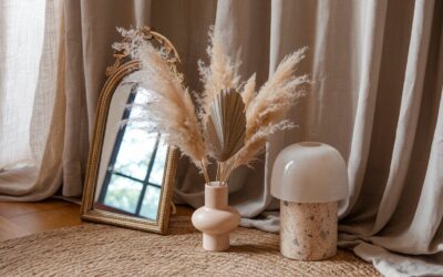
Pampas grass has become a popular element in home decor due to its natural, airy appearance and versatility. It can add texture, warmth, and a touch of nature to your space.
How Pampas Grass Complements Various Color Palettes
Pampas grass is neutral in color, typically ranging from light beige to pale pink. This neutrality allows it to complement various color palettes, from earthy tones to more vibrant schemes. It can soften bold colors and add depth to monochromatic designs.
Styling Tips for Incorporating Pampas Grass into Different Rooms
- Living Room: Use tall pampas grass in a floor vase to create a focal point or add it to a coffee table arrangement for a touch of elegance.
- Bedroom: Place pampas grass in a vase on your bedside table or dresser for a calming and natural element.
- Bathroom: A small arrangement of pampas grass can add a spa-like feel to your bathroom, enhancing the overall ambiance.
Exploring the Language of Color
Choosing the right color palette for your home is a crucial step in creating a harmonious and beautiful living environment. By understanding the psychology of color, considering cultural significance, and using practical tips and tools, you can select a palette that reflects your personal style and enhances your home’s atmosphere.
Don’t be afraid to experiment and trust your instincts, and remember that natural elements like pampas grass can add the perfect finishing touch to your design. Embrace the power of color to transform your home into a sanctuary that brings joy and comfort to you and your loved ones.